Just a quick post. We’ve recently been working on UI for RegsApp.com and we’ve been coming into contact with some interesting UI challenges. Notably figuring out how to present some reporting information in our front-end for admins.
One of the more challenging ones is knowing what elements/patters are available to use.
Simple data
A challenge that we often spend a lot of time talking about is displaying data in a way that won’t confuse people.
The most recent conversation I had with our lead developer was around how best to present some grouped reporting data.
Option 1
Present a list of data => That links to another list of data => Where you can generate reports
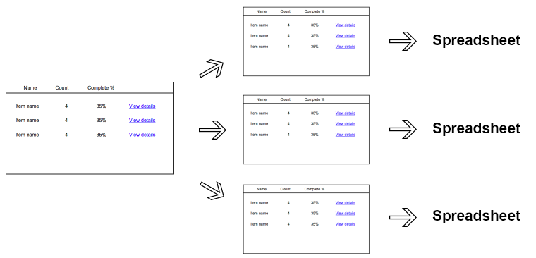
Option 2
Present a list of data => Where you can download a summary as a CSV or view a report
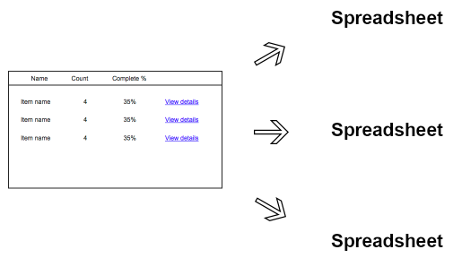
Presented in this fashion it seems obvious. Option #1 has three steps & two lists, where Option 2 only has one list and one or two actions.
Answer
Our initial gut said option 1. But the added complexity of having to go through additional screens to get to the data just didn’t make sense.
We went for option 2. The reasons are simple, we could present the information that users need to do their job in a spreadsheet format which based on our research is what they wanted.
Resources
Here are three quality resources that I’d recommend taking a look at if you’re designing/conceiving a user interface:
- D3 Gallery – A quite complete gallery of a visual indexes & charts
- GoodUI.org – Genius selection of 54+ areas you can improve your UI + other v.useful info
- UIPatterns.com – Reoccurring solutions to deal with common design challenges
- Quince – Site looks old but they have some great patterns and solutions